Analyzing B2B Industrial Product Interfaces
Competitive UX Audit - Industrial Product Interfaces
My role
Researcher
Tools
Figma, Figjam, Maze
Timeline
Spring 2025
Overview & Goals
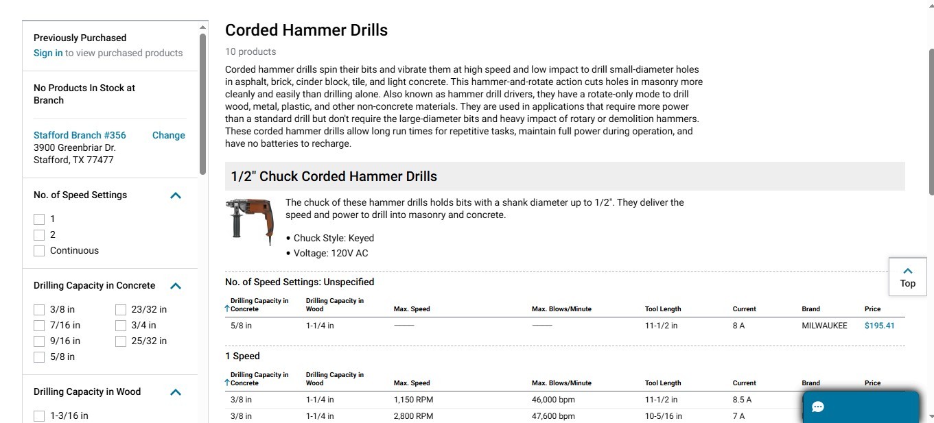
This analysis evaluates the UX of three leading B2B industrial platforms—Hilti, Grainger, and Siemens—focusing on finding and evaluating a technical product or SKU.
My Role:
As the sole researcher, I conducted a competitive UX audit of these three focusing on two major flows.
Goal:
This audit highlights how well each platform supports searchability, usability, and clarity for technical users like engineers, procurement specialists, and contractors. The goal was to uncover patterns and gaps in the UX strategies of enterprise-level, industrial tools.
Companies: Hilti, Grainger, Siemens
Task: FInd & Evaluate product or SKU
Audit focus: Clarity & Usability
Competitive Matrix Overview Table
🔍
Grainger: Efficient, but Lacking Personalization
Grainger excels in efficiency and system feedback with real-time filters and clear status updates that simplify repeat purchases for industrial users. However, it lacks personalization and onboarding to support a wider range of users.
🔍
Hilti & Siemens: Dense IA Hinders New Users
Hilti and Siemens suffer from dense IA and limited guidance, creating barriers for first-time or less technical users navigating complex product catalogs.
🔍
Accessibility & Clarity: A Shared Weakness Overall
Accessibility and minimalism are consistent weak spots, with all platforms showing opportunities to reduce cognitive load through cleaner layouts and progressive disclosure.
UX Criteria
Navigation & IA
Search & Filtering
Product Info Clarity
Visual Hierarchy
Feedback & Error
States
Hilti
✅ Clear mega-menu, categorized by profession and product line
⚠️ Basic filters, limited options to narrow complex SKUs
✅ Detailed product pages, good use of specs & downloadable PDFs
⚠️ Content blocks are heavy; dense layout
✅ Quick feedback; form validation and system alerts are visible
Grainger
✅ Intuitive categories, and smooth flows
✅ Quick filtering with real-time updates and saved lists
✅Smooth spec formatting, quick scan and deep dive on info
✅ Balanced use of space, good CTAs and whitespace
✅ Clear status indicators and feedback during filtering/order flows
Siemens
⚠️ IA is hard to scan; feels more like a marketing site
⚠️ Filter UI not intuitive at all.
⚠️ Dense, text-heavy with minimal visual hierarchy in product info
❌ Poor contrast, minimal visual prioritization in key UI sections
⚠️ Lacks feedback when filters/search return no results
Flow 1 : Product Search and Filtering
Alex, a procurement manager at a mid-sized construction firm, needs to quickly find and compare cordless drills across three vendors—Hilti, Grainger, and Siemens. He wants to narrow down by voltage, brand, and availability
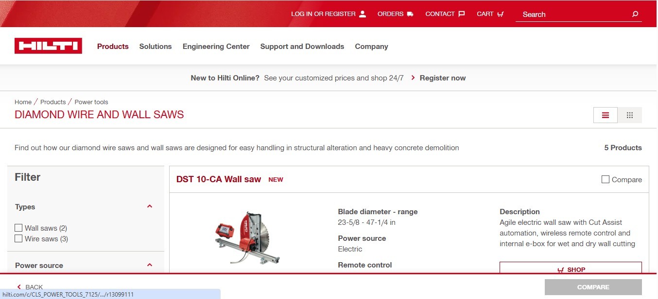
Hilti Key Findings
✅ Clear top-positioned search bar
✅ Simple, easy-to-use filter options
✅ Relevant search results with rich data
✅ User-friendly grid layout
Hilti Key Issues
⚠️ Limited advanced filtering options
⚠️ Some search results feel disorganized
⚠️ No strong sorting or refinement controls
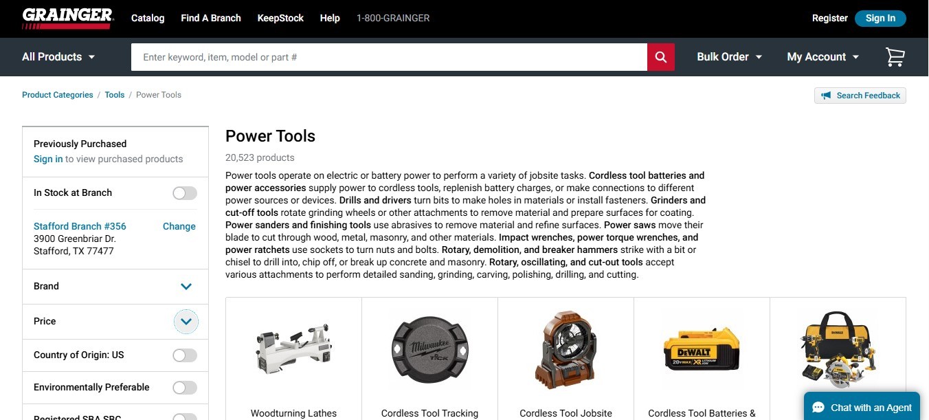
Grainger Key FIndings
:✅ Auto-suggest search bar
✅ Strong categorization and filter granularity
✅ Clear product groupings
Grainger Key Issues
⚠️ Sidebar filters can feel overwhelming
⚠️ Product cards lack detail in search results
⚠️ Some lag in loading search/filter results
Siemens Key FIndings
✅ Advanced technical filters available
✅ Well-structured grid layout for results
✅ Search feels accurate and robust
Siemens Key Issues
⚠️ Overwhelming filter complexity for non-experts
⚠️ No pricing info in search view
⚠️ Some filters are hard to find or slow to respond

Flow 2: Product Detail Page (PDP) Exploration
Alex selects a promising cordless drill from each site and now needs to evaluate whether the product meets the firm’s needs. He’s looking for specs like torque, battery life, warranty, and downloadable technical documents.
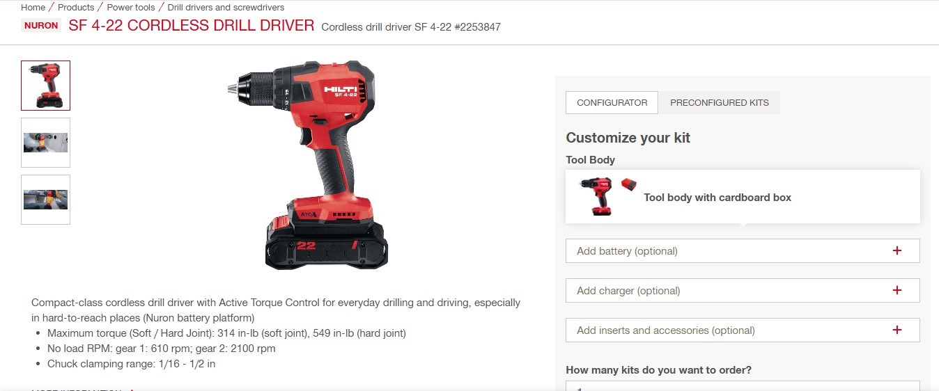
Hilti Key Findings:
✅ High-quality, zoomable images
✅ Comprehensive specs and product descriptions
✅ Prominent “Add to Cart” CTA
Hilti Key Issues
⚠️ No related product recommendations
⚠️ Technical docs are buried under other sections
⚠️ Layout can get cluttered, especially on mobile
Grainger Key FIndings:
✅ Rich, scannable specs and availability info
✅ Clear CTAs with fast access to purchasing
✅ Upsell/cross-sell content effectively integrated
Grainger Key Issues:
⚠️ Some low-resolution product imagery
⚠️ Verbose product descriptions
⚠️ Lacks 360° product views or enhanced visuals
Siemens Key FIndings:
✅ In-depth product info and high-res visuals
✅ Clean, readable layout
✅ Easy access to documentation PDFs
Siemens Key Issues:
⚠️ Add to cart or action buttons are far down
⚠️ Product text blocks can be overly long
⚠️ No video/3D support for technical visualization

Key Takeaways & Suggestions
Filtering & Data > Aesthetic UI
Technical users rely on strong filtering and data visibility more than flashy design.
Grainger: Speed, Siemens: Depth
Grainger is optimized for quick, repetitive purchasing, while Siemens assumes deep technical familiarity.
Accessibility & Clarity Lacking
All platforms under-serve users with accessibility needs or cognitive load reduction.
Improve IA & Disclosure
Opportunities exist in progressive disclosure, IA restructuring, and better onboarding for first-time users.
Suggestions
Hilti: Enhance filtering options and integrate related product suggestions.
Grainger: Improve image quality and streamline filter options.
Siemens: Simplify filter complexity and reposition key action buttons for better accessibility.
What I’d Do Differently
Change category structure.
Reorganize Hilti’s category structure around job site needs vs. product types so that there is clarity and ability to filter through information.
Add guided search.
Add guided search and specifically for Siemens' dense catalogs to support a smoother search that is effective.
Unified Search.
Create a unified compare-and-save feature across Grainger product lines. This is something that was in the works at my internship at Zurn Elkay as well.