Options Zurn Website
Maximizing workflow & performance for engineers
View Final Work
My role
Designer & Researcher
Tools
Figma, Photoshop, Maze
Timeline
1 month

What is this?
What’s the solution
Poor information architecture was found based on the current data that was given which affected user's experience. This coupled with unclear navigation and poor aesthetics compared to the rest of the site made it seem different compared to the rest of the
Impact on business.
Poor information architecture was found based on the current data that was given which affected user's experience. This coupled with unclear navigation and poor aesthetics compared to the rest of the site made it seem different compared to the rest of the
What’s the solution
Poor information architecture was found based on the current data that was given which affected user's experience. This coupled with unclear navigation and poor aesthetics compared to the rest of the site made it seem different compared to the rest of the
Scope
Streamline engineer and architect work efficiency through improving existing interface while supporting design and brand consistency.
Understand
Explore
Materialize
Understanding the problem - Current pain points
Consistency & Standards Issue. The overall aesthetics & designs are inconsistent with the rest of the website, feels like another website.
Flexibility & Efficiency of Use Issue. Long list of options that causes users to scroll endlessly.
Efficiency Issue. Inefficient way of filtering through information to find the proper product & its related files.
Proximity & Scanning Issue. The way information is displayed such as information on the product is not presented effectively.
Explore the task repetitively.
Let’s delve deeper into this.

Poor IA Structure
Chooses by location and then product line but certain representatives that are close to the zip code/city are not shown. This would confuse users and not provide them the most accurate options based on where they are at. Also certain zip codes are not listed, and there is no feedback on what to do.
Lo-fi - Improving access to information.

Kept the list system to easily track information down the page with short numbers was easier, and used colored columns to break up content with branding too.
2
Used a tag dropdown system to simplify and filter options so that engineers can find what they need.
Ex: User chooses a tag option in the dropdown and the list filters to that specific category saving time.
1
Kept the the look the same with other tools with the card that has all action needed to be taken. This connects the Zurn brand so that learnability and consistency are used throughout the website.
3

Once results are found, we used card components to clean up information using visual hierarchy through typography and color.
4
Lo-fi - Improving access to information.
IA structure flows
But we realized from our data that certain representatives do not show up if you choose by location. The representative would not show because they were outside of a certain location even if the were in a certain product line. That representative would not show up or no results would show up at all.

IA structure flows
We came down to two main options and decided A/B testing would allow us to see which ones users would prefer.
Their recommendations were:
Preferred results being shown below. Users they talk with want said too much information causes confusion.
Add a View All page. Many users want to see all representatives regardless of location at times.
Group the initial portion so all the elements are in one spot & users don't have to find what to input and where it is.

Materialize the final product.
Accessibility
Implementing a design system that would have consistent fonts, colors, and standards.
All designs follow WCAG standards in terms of font, colors, and flexibility.
All designs implemented dark mode & mobile versions.
Alt tags and SEO descriptions included with all necessary content.

Adjustments

Grouping information to be direct
Instead of having a page of options all over the page, we centralized and brought attention to the main actions needed. It guides the user through the actions and arrives to the CTA.
Adding the “View All Page”
An addition through testing, users the ability to see all representatives of a product line. This would let them reach out to representatives in a certain area if contractors need to deliver to a particular customer.

Adding visual hierarchy through contrast for importance.
For each card component, they have a visual importance as to which individual they should reach out too. It also clearly states the location and gives a clear indicator of the different calling options.
Hi-fi Designs
Mobile Designs
Clear action box

Visual representation

Clear card components


Clear action box

Conclusion
This project was one of the first projects I worked on during my internship and receiving a project with so much impact on the company overall in terms of revenue, customer interactions, and support. I was able gather research, go through my process, and be able to design solutions that hit the heart of the problem and support users.
What I learned
Data influences design.
Design is limited without data, which helps us see we have to work with, which effects and shapes potential designs.
Progress over perfection.
Collaborating with marketing, digital operations, and HR teams demands quick, iterative designs. Feedback trumps “perfect” designs.
Testing trumps all.
Testing reveals gaps in designs and provide a quick feedback loop of information which provides key improvements.


Zurn Spec Sheets Finder Platform
Redesigning Zurn's Options Tool: Enhancing Engineer Workflow Efficiency
My role
Designer & Researcher
Tools
Figma & Maze
Timeline
1 month


TL;DR
Redesigning a Critical SKU Tool for Engineers
Problem:
Zurn Elkay technical users (engineers & architects) relied on this tool daily—but poor UX slowed down spec retrieval, increased confusion, and created brand inconsistency across the site. Also, this tool was undervalued by stakeholders despite its role in projects and workflows.
Solution
I redesigned this engineering tool used to find SKU's & drawing files. I cut retrieval time by 55%, achieved brand consistency, and secured stakeholder buy-in — leading to faster engineering workflows and a scalable design system.
50% Faster SU Retrival
Usability testing showed engineers completed key tasks in nearly half the time.
88% Success Rate
Engineers located drawing/spec files quicker with minimal confusion.
Stakeholder Buy-In
A/B tests and clean mid-fis helped drive leadership alignment.
Before

After
Problem: Daily Workflow Friction
Problem:
Zurn Engineers rely on speed, clarity, and structure to complete their work efficiently. But Zurn’s SKU tool impacted speed—
"slowing down teams, hurting productivity, and damaging efficiency."
With engineers using this tool 3-5 times daily, workflow friction wasn't just a user experience issue—it was directly impacting project timelines and team productivity.
"By the time I get to a drawing file, it takes so long and I have to do it over and over again. It's frustrating."
-Zurn Engineer
Critical Issues
Poor UI and lack of visual hierarchy for the results
Difficulty locating and accessing product options quickly
Long list of SKU's = takes too much time = Engineers are on this all day = Inefficient
Inconsistent branding created disconnect from main Zurn ecosystem
Has sections but not clickable, must scroll to access. Even if we made it clickable, there would be long scroll/load time with 30+ categories for sections.

Poor scanning to view information.
Engineers would mention they would be on this all day, and looking back and forth on a large monitor.
Usability Review: Inefficient Flows
We prioritized issues based on usability heuristics, not assumptions. Here are some of the issues we found:

Inconsistent UI

Slow Filtering & Use
Inconsistent UI
It presents a long list, requiring users to know the product type and scroll extensively—slowing down their workflow.
No branding makes it unclear to engineers what page they’re on; the tool doesn’t match Elkay and looked like another page.
Slow Filtering & Use
It presents a long list, requiring users to know the product type and scroll extensively—slowing down their workflow.

Cluttered Product Info
The information for the product SKU is not shown to scan information quickly and download the needed drawing files.
User Interviews: Engineers Spending
Too Much Time On A Daily Tool
We conducted 45-minute semi-structured interviews with 4 Zurn Engineers to understand workflow pain points with the current SKU tool. Participants were recruited through engineering team leads and had 3-6 years experience using the tool.
Here is what we found:
Too Many SKUs, Time Consuming
A long, single-line SKU list and 30+ category pages made it difficult to find what they needed.
Wasted Time on Simple Tasks
A task that should take seconds—took minutes and disrupted project flow.
Hard to Scan, Hard to Match.
Results lacked hierarchy and users struggled to match files to the right SKU.
"I spend too much time trying to find the SKU especially when I need spec sheets multiple times during the day"
-Zurn Senior Engineer
"Kills my flow when I'm working, and its frustrating."
-Zurn Engineer
Research Summary: Where the Tool Broke Down
Constraints
Stakeholders initially underestimated the tool’s value, overlooking how much it impacted engineering productivity and project timelines. Time was also low, with a barely a month for the whole process, I had to be picky with the methods we choose for all phases = give best ROI
Workflow Bottleneck
Engineers struggled to locate spec sheets and drawing files quickly, creating inefficiencies that slowed workflows and hurt overall productivity.
Branding Breakdown
The tool felt visually disconnected from Zurn’s ecosystem, reducing credibility and lowering confidence in the platform.
Business Alignment
Highlighting friction through early design exploration helped shift stakeholder mindset, showing how UX could drive clarity and efficiency.
Priorization Matrix: Analyzing High Impact Features
After research, with a tight deadline for the merger, we focused on ideating through a feature matrix and mid-fi designs to get most bang for our buck. I created a prioritization matrix to weigh impact vs. effort. This helped align the team on what would deliver the greatest value to engineers
Here is what we found:
SKU Finder Filter System
Reduce scrolling and find the cateogory for their SKU asap.
Clean Scanning for Information
Improved scanning and hierarchy so users could find the right specs files faster.
Clean Action Box At Top
where users would enter actions in 1 spot - similar to other tools that I designed to create ecosystem
Low effort
High effort
High impact
Low impact
Incremental
Easy wins
Big bets
Money pit


START HERE
DO THESE NEXT
FILL-INS
THANKLESS TASKS

Mid-fi
The goal for mid-fi's were to redesign the SKU selection flow to reduce friction, improve clarity, and align with Zurn’s design system—for quicker workflow for engineers and architects.
Key Design Decisions
Dropdown System for All Units
This simplified the flow, and we included it in a top box for all action elements to be in.
Using Color For Recognition
Used single file list with alternating colors of our brand style to find SKU quickly.
Two list formats for A/B testing
If a engineer had to manually find a SKU, we toyed with single file format or column format for testing.
Clean Cards with Proper Hierarchy
In previous cards, they stretched across the screen, had no hierarchy. With these we have downloadble files in buttons, and SKU listed clearly.

Dropdown for 30+ categories
Replaced the long scroll with dropdowns and have all action items in a top box section.

Poor scanning to view information.
Engineers would mention they would be on this all day, and looking back and forth on a large monitor.

Used branding styles to get clean card that was easy to read.
Used familiar card components from Zurn’s ecosystem to ensure visual consistency and improve usability.
Usability Testing
We ran testing with 8 Zurn Engineers and improved ability find spec sheets. Each engineer completed the same 3 SKU lookup tasks using both layout options. Tasks included finding specific product specs, downloading drawing files, and locating alternative SKUs.
The two layouts we tried were:
- One with tag dropdowns and a multi-row format for the different categories.
- One with a tags on screen and a wider layout of options.
On a scale of 1-10, How effective was it to locate the files needed under each sku?
7 Out of 8 Participants rated this 8 or higher.
How much more quicker is it to get to the needed SKU or file?
5 Out of 8 Participants rated this 8 or higher.
On a scale of 1-10, Did you prefer using the tag filtration system?
8 Out of 8 Participants rated this 8 or higher.
Hi-Fi: Enhanced Navigation, Streamlined Results, and Strengthened User Focus
We took these insights and implemented this into our designs.
Implement Tag Based System
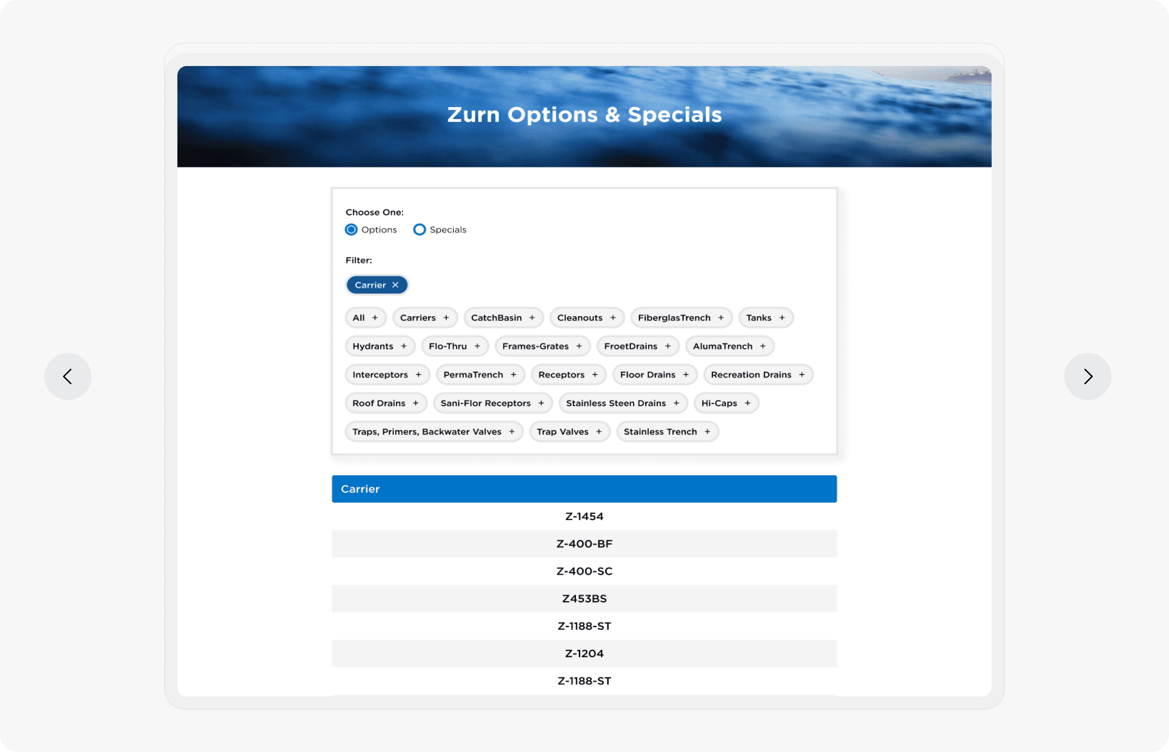
Removed dropdowns to let users filter SKUs instantly with a single tap—no extra steps.
Single file list for scanning
Engineers preferred the original list for scanning. We kept it, but improved structure and spacing.
Added Visual Consistency
Applied Zurn’s refreshed design system for clean, accessible UI and improved user trust.
Visual Hierarchy and Clarity
Cards visually grouped making it easier for engineers to scan, understand, and take action.

Original UI: A long list of SKU's and another tab with 30+ categories

Updated UI: Tag system for efficient SKU Retrieval
Outcome: Driving Efficiency and Business Growth
UX Outcome
55% task time reduction – Engineers completed SKU lookups faster with simplified flows and direct filters
88% file-finding success rate – A/B testing showed strong usability gains compared to earlier wireframes
100% filter preference – All testers preferred the one-click tag system over dropdowns
Stronger layout & scannability – Visual card grouping and spacing improved navigation and reduced overwhelm
Business Outcome
Increased internal buy-in – Test-backed designs and usability wins convinced stakeholders to prioritize the tool
Improved engineering workflows – Faster access to spec files helped reduce project delays
Better brand perception – Applied Zurn's refreshed design system to reinforce professionalism and consistency
Future-ready UX foundation – Reusable UI patterns set the groundwork for other internal tools and scale
What I Learned
This redesign turned a slow, outdated tool into a fast, intuitive experience built for real engineering workflows that currently is used by all Zurn engineers in their daily workflow.
Stakeholder Buy-In.
I learned to advocate for users when priorities clashed, gaining stakeholder support and balancing user needs with business goals.
Teamwork.
Having two large project to work on - I leaned on my team for feedback. I also reached out to other teams - marketing, developer, etc - for their insights.
Taking Perspectives.
Push ego aside and take perspectives from not only users, but from others who are involved in the project such as engineers, etc.
But wait there more....

Internal Used Card Quoting Platform
Turbo: Streamlining Car Shopping With Unified Quote Comparisons
Cars
Quote Tool
SAAS
55%
Improved Efficiency
Post Usability Testing
102%
Improved Efficiency
Post Usability Testing
View Case Study
Options Zurn Website
Streamlining Car Shopping: Compare and Analyze Car Price Quotes Across Multiple Platforms
My role
Designer & Researcher
Tools
Figma, Photoshop, Maze
Timeline
1 month
View Final Work
What is this?
What’s the solution
Poor information architecture was found based on the current data that was given which affected user's experience. This coupled with unclear navigation and poor aesthetics compared to the rest of the site made it seem different compared to the rest of the
Impact on business.
Poor information architecture was found based on the current data that was given which affected user's experience. This coupled with unclear navigation and poor aesthetics compared to the rest of the site made it seem different compared to the rest of the
What’s the solution
Poor information architecture was found based on the current data that was given which affected user's experience. This coupled with unclear navigation and poor aesthetics compared to the rest of the site made it seem different compared to the rest of the
Scope
Streamline engineer and architect work efficiency through improving existing interface while supporting design and brand consistency.
Understand
Explore
Materialize
Understanding the problem - Current pain points
Information Architecture Issues.
Current site makes user select by zip code/city first, but what if the zip code/city is not listed?
Discoverability Issues.
There is no ability to change the range of the inputted zip code.
Needs Minimalistic Design.
Need supporting aesthetics to find and filter information more efficiently = Need for support while avoiding distractions.
Findability Issues.
Not all product lines are under all the different zip codes.
Lack of Feedback/Findability Issues.
When choosing a different country, it kicks the user back to the main page.
Poor Error Use.
A ”no results page” does not exist.
Let's discover
What does this do?
Chooses by location and then product line but certain representatives that are close to the zip code/city are not shown. This would confuse users and not provide them the most accurate options based on where they are at. Also certain zip codes are not listed, and there is no feedback on what to do.
Which to choose?
Chooses by location and then product line but certain representatives that are close to the zip code/city are not shown. This would confuse users and not provide them the most accurate options based on where they are at. Also certain zip codes are not listed, and there is no feedback on what to do.
Lack of Aesthetics
The information for the product SKU is not shown to scan information quickly and can be shown in a cleaner way.
Lo-fi - Improving access to information.
Used a tag dropdown system to simplify and filter options so that engineers can find what they need.
Ex: User chooses a tag option in the dropdown and the list filters to that specific category saving time.
1
Kept the list system to easily track information down the page with short numbers was easier, and used colored columns to break up content with branding too.
2
Kept the the look the same with other tools with the card that has all action needed to be taken. This connects the Zurn brand so that learnability and consistency are used throughout the website.
3
Once results are found, we used card components to clean up information using visual hierarchy through typography and color.
4
IA structure flows
But we realized from our data that certain representatives do not show up if you choose by location. The representative would not show because they were outside of a certain location even if the were in a certain product line. That representative would not show up or no results would show up at all.
IA structure flows
We came down to two main options and decided A/B testing would allow us to see which ones users would prefer.
Their recommendations were:
-Preferred results being shown below. Users they talk with want said too much information causes confusion.
Add a View All page. Many users want to see all representatives regardless of location at times.
Group the initial portion so all the elements are in one spot & users don't have to find what to input and where it is.
Materialize the final product.
Accessibility
Implementing a design system that would have consistent fonts, colors, and standards.
All designs follow WCAG standards in terms of font, colors, and flexibility.
All designs implemented dark mode & mobile versions.
Alt tags and SEO descriptions included with all necessary content.
Adjustments
Grouping information to be direct
Instead of having a page of options all over the page, we centralized and brought attention to the main actions needed. It guides the user through the actions and arrives to the CTA.
Adding the “View All Page”
An addition through testing, users the ability to see all representatives of a product line. This would let them reach out to representatives in a certain area if contractors need to deliver to a particular customer.
Adding visual hierarchy through contrast for importance.
For each card component, they have a visual importance as to which individual they should reach out too. It also clearly states the location and gives a clear indicator of the different calling options.
Hi-fi Designs
Mobile Designs
Clear action box
Visual representation
Clear card components
Clear action box
Conclusion
This project was one of the first projects I worked on during my internship and receiving a project with so much impact on the company overall in terms of revenue, customer interactions, and support. I was able gather research, go through my process, and be able to design solutions that hit the heart of the problem and support users.
What I learned
Data influences design.
Design is limited without data, which helps us see we have to work with, which effects and shapes potential designs.
Progress over perfection.
Collaborating with marketing, digital operations, and HR teams demands quick, iterative designs. Feedback trumps “perfect” designs.
Testing trumps all.
Testing reveals gaps in designs and provide a quick feedback loop of information which provides key improvements.