Fitness Mentor.Ai calorie tracking app
Rebuilding a Calorie Tracker: From Zero Engagement to a Thoughtful, Usable Flow
Explore the Final Designs & Impact

My Role
Sole Product Designer(Co-Founder), working with 1 developer
Tools
Figma, ChatGPT, Illustrator, Maze,
Client
Early-stage startup
Timeline
2 month
Overview
Redesigning a Critical Engineer Tool: A Streamlined SKU Experience
Project Summary:
A live calorie tracking app had launched—but users weren’t sticking around. The experience felt clunky, outdated, and didn’t deliver day-to-day value. As the sole product designer and late-stage co-founder, I led a complete UX/UI overhaul to rebuild trust, streamline calorie tracking, and create an experience users would actually return to.
My Role:
Sole UX/UI Designer and visual lead
Led end-to-end product redesign (UX strategy, flows, wireframes, UI, components)
Conducted UX audits, user research, and competitive analysis
Built new flows for onboarding, calorie input (manual/photo), tracking, and reports
Created a responsive Figma component library for handoff
Collaborated directly with the co-founder/developer for implementation
Results:
5– U
1 – I
9– M
C – D
Sc – Cr
Before: Onboarding & Home Screen
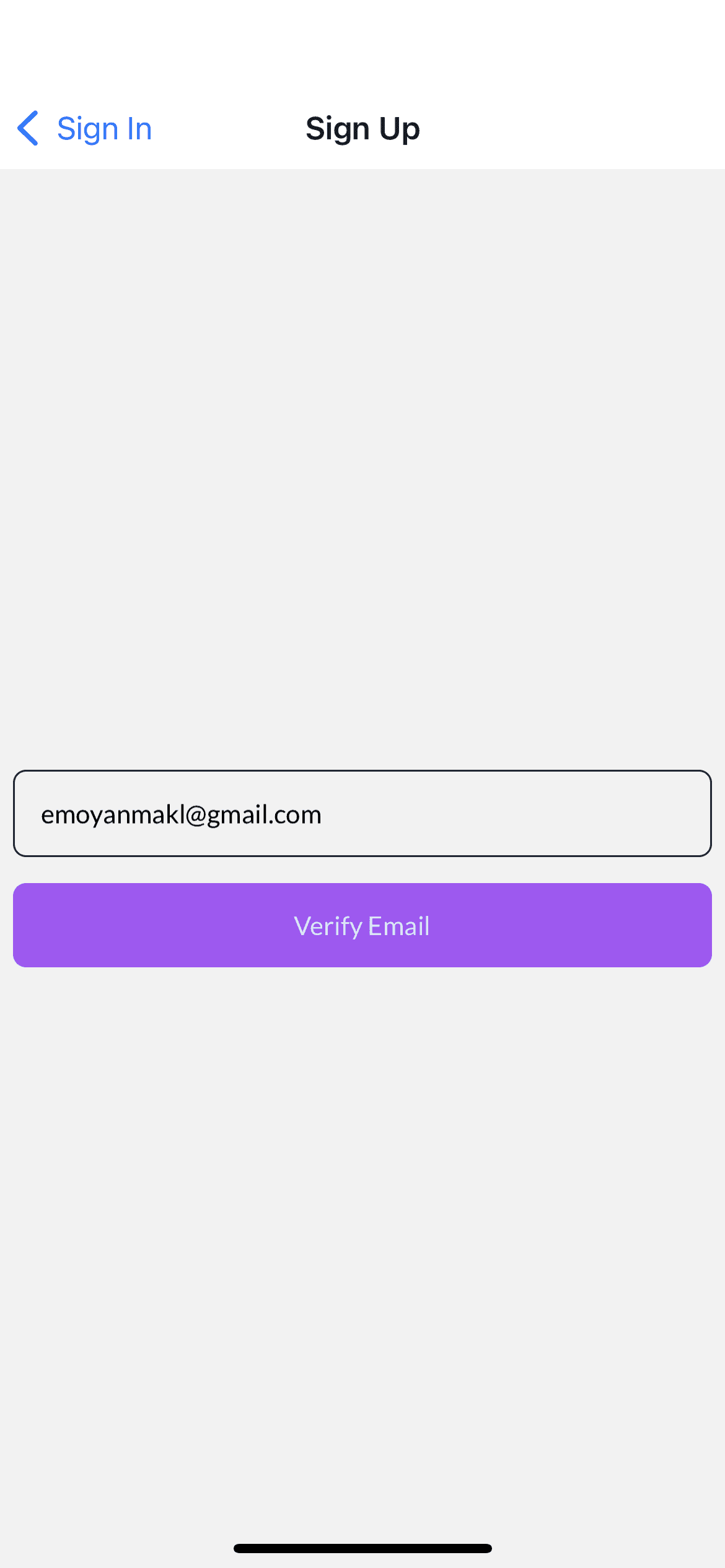
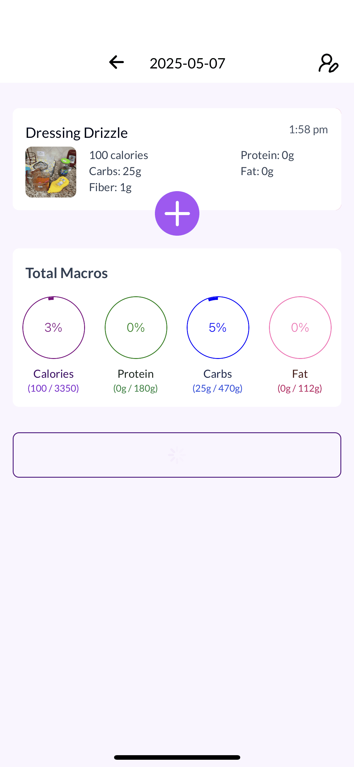
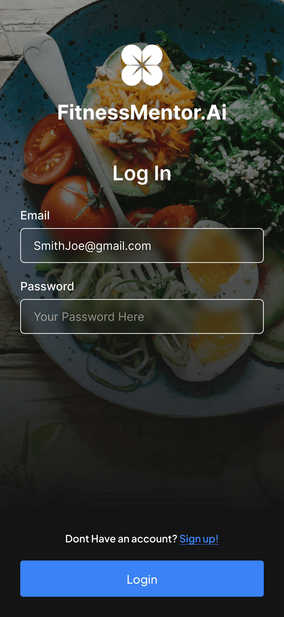
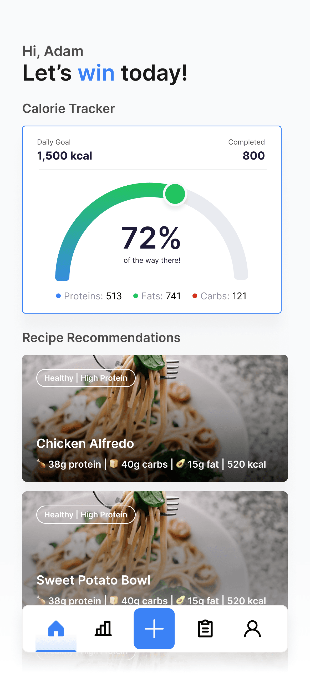
After: Onboarding & Home Screen
Challenge & Opportunity
The Problem: A Live App with Zero Engagement and No Clear Value
Our team inherited an existing calorie-tracking app that was already live in the App Store — but with almost zero engagement.
The concept had potential: an AI-powered wellness coach in your pocket. But the execution left users confused and unmotivated. Early adopters churned quickly, and the app failed to retain trust or build traction. We uncovered several core issues:
Unclear onboarding with no sense of personalization or encouragement
Cluttered UI with disjointed flows and missing feedback loops
No support for modern food logging like photos, substitutions, or smart meal suggestions
Limited value in day-to-day use, lacking reinforcement, community, or meaningful guidance
The MVP promised a private, AI-powered wellness experience — but what users got felt generic, clunky, and ultimately forgettable.
Problem Statement:
A live app with no engagement — users were met with friction instead of flow. The cluttered UI, confusing input methods, and lack of feedback drove them away.We set out to reimagine the experience with clarity, trust, and daily usability at its core.

Only One Input Option
Users could only “Enter a VIN” — no alternative for make/model, unlike standard platforms.
Little to no branding or trust established
This is the landing page and the user has no idea who the company is, and what they do. Clear branding issues.

Poor Readability & Layout
Input fields faded into the background and were randomly grouped, making the UI feel untrustworthy.
No Error Feedback & User Freedom
All these had no error feedback and also user have no idea of what the required sections to fill out.
To understand where users were struggling and how to rebuild a product they'd actually use, we began with foundational user research.
Research Foundation: Transforming Assumptions Into Actionable User Insights
Meeting Objective Overall: and main reserach things we did. and why!
Goal: Design a seamless experience for comparing used car prices across platforms and getting accurate quotes quickly.
Challenge: Build a clear, functional system from a vague concept—no existing UX, UI, or brand direction.
Approach: I kicked off with a research plan to clarify the vision, define user needs, and evaluate competitors. Through workshops, audits, and analysis, I laid the foundation for a scalable, user-centered platform focused on clarity, trust, and accessibility.
Direction & Discovery: Aligning on Goals and Expectations

What’s the goal of this webiste?
Today’s car buyers waste time bouncing between tabs and platforms—KBB, Edmunds, CarGurus—just to get a reliable quote. We needed to solve that with a centralized, confident experience.
Overview:
Combine your:
Discovery Call
Early team convos
Founding vision
Answer:How did the founder/team see the product?
What were the early ideas and goals?
What UX decisions did you push or frame differently?
This shows leadership and product thinking.
connection to next part.
Uncovering Existing Usability/UI Issues
Why I Did This
Identify where the experience broke down & set clear direction for our redesign.
Use a standardized framework to prioritize issues based on severity, not assumption
Key Findings
Error Prevention: No safeguards during quote entry, increasing risk of user mistakes
Recognition Over Recall: Poor visual hierarchy forced users to remember steps and content
Visibility of System Status: No feedback during form submissions or quote retrieval
Aesthetics & Minimalstic Design: Outdated UI reduced user trust and overall clarity
Why It Mattered
These usability breakdowns directly impacted trust, efficiency, and task completion—three essentials for a quote comparison platform handling complex user inputs.
Let’s look at these issues in detail…

Issue 1
dfdf

Issue 2
dfdf

Issue 3
dfdf
Trainsiton next
Market Research & Competitor Analysis: Grounding Design in Real Habits, Market Gaps, and Everyday Friction
Why I Did This
Understand industry standards across top vehicle valuation platforms.
Identify usability opportunities and feature gaps in the car quoting space.
Opportunity: Simplify the interface while maintaining transparency and trust.
What They Lack:
No Cross-Platform Quote Comparison: Users open tabs across sites; no unified view.
Minimal Personalization: No guidance based on user intent (e.g., quick sale vs. high return).
Cluttered or Dated Interfaces: Dense text, weak CTA flows, and poor hierarchy.
These gaps validated our core differentiators — smart personalization, quote transparency, and designing effieicent flows.
Trainsiton next
User Interview: Understanding Existing Friction Points.
Would you trust this website and understand what it can provide you?
66%
Of Users said yes to this statement
On a scale of 1-10, How effective & quick was it to input information?
83%
10 Out of 12 Participants
rated this 8 or higher.
On a scale of 1-10, how supportive & easy was it to find best quote for your saved price?
92%
10 Out of 12 Participants
rated this 8 or higher.
Why I Did This
Understand industry standards across top vehicle valuation platforms.
Identify usability opportunities and feature gaps in the car quoting space.
Opportunity: Simplify the interface while maintaining transparency and trust.
What They Lack:
No Cross-Platform Quote Comparison: Users open tabs across sites; no unified view.
Minimal Personalization: No guidance based on user intent (e.g., quick sale vs. high return).
Cluttered or Dated Interfaces: Dense text, weak CTA flows, and poor hierarchy.
These gaps validated our core differentiators — smart personalization, quote transparency, and designing effieicent flows.
Research Summary: Lack of Trust, Cognitive Overload & Market Gaps Created Clear UX Opportunities
Constraints
Our main constraint was the inability to directly interview customers. Instead, we relied on secondary perspectives, which we analyzed cautiously, based on designers' firsthand experiences.
Low Trust & Unclear Value
Users didn’t trust the quotes due to vague pricing logic and outdated UI.
Cognitive Overload
Dense layouts, weak visual hierarchy, and poor UX patterns overwhelmed users.
Missing Market Features
No competitor offered side-by-side quote comparison or guided,
Ideation & Design: Turning Pain Points into a Clear, Trustworthy Quote Comparison Experience
I translated research insights into a clean, intuitive car quote platform through user personas, clarified task flows, and low-fidelity wireframes.
How Research Drove Design Decisions
🔎 Simplified Information Hierarchy
Organized content to reduce overload and guide users through a quote comparison journey.🔐 Trust-Building Visual Language
Used clean UI, consistent components, and language to increase trust.🧩 Focused on Actionable Comparisons
Introduced quote cards, side-by-side layouts, and filters to make multi-platform price decisions easier.🎨 Designed for a Brand, from Colors to Layout
Built a cohesive visual identity with custom branding, color palette, and a reusable component library to support long-term growth.
To anchor the design in real user needs, I created personas based on key buyer and seller behaviors—not just business assumptions.
User Flows – Mapping a Complete Experience
To address missing screens and unclear navigation paths in the original site, I created user flows that clarified the full end-to-end journey.
Where does saved car info live?
How can users edit input for better quotes?
Why are core pages like Login or T&C missing?

What I Did
Created 2 core user flows focused on:
Getting a Car Quote
Saving + Editing a Quote
Designed flows to reflect real user tasks, such as quote comparison, account usage, and adjusting input details.
What I Found
Missing Screens
Critical screens like Sign-Up/Login, Saved Quotes, and Quote Editing were missing or unclear.
How do I change initial quote entries?
Flows revealed that users had no easy way to revisit or edit past inputs—hurting trust and usability.
No visual metric for analysis
No clear confirmation or feedback steps in the process led to confusion about whether tasks were completed.
To identify missing pages and ensure a complete, intuitive experience, I created user flows that mapped out the entire website journey.
Shaping the MVP
Why This Helped
This let me align with who we're designing for, helping us make decisions based on user goals, behaviors, and pain points—not assumptions
With a full-picture view of the user journey, I began low-fidelity wireframes to translate key flows into tangible screens. This helped test structure, layout, and new page ideas early — before refining visuals or interactions.
Lo-fi: Rapid Concept Validation & Clear Information Input
Easy, clear inputs, clear messaging & efficient
I sketched out paper low-fidelity wireframes focused on understanding missing screens and flows, understanding how components would be placed.
Goals for the Lo-Fi Phase:
Simplify the Entry Flow
Restructure the input process (VIN, model, etc.) to feel intuitive and less overwhelming.Clarify Turbo’s Value Early
Introduce what the tool does and why it’s trustworthy—establish credibility upfront.Design for Reusability & Scale
Create modular components like quote cards and car info blocks that could scale across screens.Build in User Guidance
Ensure each step had inline help or system feedback to prevent errors and reduce frustration.

After reviewing lo-fi sketches with the team, I moved to mid-fi wireframes to refine the layout and hierarchy. We paused testing to first lock in the UX structure and start shaping the UI before usability testing.
Mid-Fi - Improving access to information.
What We Did:
Built reusable components – Text fields, cards, dropdowns, hover states, and error messages for consistency
Clarified task flows – Broke car input into multi-step progress to reduce overwhelm
Enhanced hierarchy – Improved visual clarity with clear call-to-actions, readable font sizes, and distinct layout sections
Built trust through UI – Landing page communicates “how it works,” emphasizes benefits, and guides users through Turbo’s core value
Improved saved car section – Designed intuitive card layout with edit/delete actions and “Learn More” clarity
Hero section with input field and single CTA (“Search”)
Focused landing entry point. Early users didn’t understand where to start—this hero anchors their journey.
1
4-step “How Turbo Works” section
Addresses one of the biggest usability gaps: lack of context. We learned users didn’t trust the tool or know what would happen next. This section builds confidence and expectation.
2
“Why Us” block with icons and short explanations
Establishes trustworthiness, time-saving, and ease—direct responses to research themes of skepticism and confusion around value.
3
Lo-fi - Improving access to information.

Design Principle: Used trust-building UX writing and visual cues to help users understand, trust, and act.
Form split into two grouped sections: “Basics” and “Conditions & History”
Based on our heuristic review and early feedback, large forms overwhelmed users. We segmented the process into logical, digestible chunks to improve flow and reduce drop-off.
1
Lo-fi - Improving access to information.
TURBO
Log In
Sign Up
Let’s Gather Information
Fill Out and Gain Instant Access!
Basics
ZIP
Mileage
Trim
Exterior Color
Select Value
Black
White
Red
Interior Color
Select Value
Blue
Beige
Black
What's the ownership status of your vehicle?
Owned
Leased
Financed
Conditions & History
Has your vehicle ever been in an accident?
Yes
No
If so, how many times?
0
1
2+
What is the condition of your vehicle?
Excellent
Rough
Fair
How many keys do you have for this vehicle?
0
1
2+
Has the vehicle been smoked in?
Yes
No
What is the car’s interior material?
Interior Material
Select Value
leather
nylon
vinyl
alcantra
polyster
artificial leather
faux leather
What type of title does the vehicle have?
Clean
Savage
Rebuilt
Does the vehicle have any aftermarket parts?
Yes
No
Enter Below
If yes, please list what parts?
Does the vehicles have any mechanical issues?
Yes
No
Enter Below
If yes, please list the issues.
Does the vehicles have any serious conditions that would affect driving?
Yes
No
Enter Below
If yes, please explain
Does the vehicle have exterior damage?
Yes
No
Enter Below
If yes, please explain
Is the windshield damaged?
Yes
No
What is the condition of the tires?
Excellent
Bad
Poor
Get Quotes
Save Vehicle
TURBO
Finding the best cars for you.
Contact : turbo@gmail.com
3
Design Principle: Enhanced cognitive load management to make filling out vehicle details feel achievable.
Dropdowns instead of open fields
Limited user input errors and guided users through the process. This was a direct fix for confusion seen during earlier testing.
2
1
Dropdown filter above cards
Introduced early sorting for scalability. Users mentioned frustration when revisiting quotes and having no way to filter or organize.
“Learn More” CTA on each card
Encourages deeper exploration while keeping the initial view minimal. Reinforces user control—users decide when to dive deeper.
2
Lo-fi - Improving access to information.
TURBO
Saved Cars
Select Value
Newest to Oldest
Oldest to Newest
By Price (Lowest)
By Price (Highest)
By Condition (New to old)
By Condition (Old to New)
Alphabetically

Brand
BMW
Price
$13,600
Condition
New
Learn More
Brand
BMW
Price
$13,600
Condition
New
Learn More
Brand
BMW
Price
$13,600
Condition
New
Learn More
TURBO
Finding the best cars for you.
Contact : turbo@gmail.com
Card-based layout for saved cars
Designed to provide a scannable overview of each vehicle's key info. Our research showed users wanted a simple way to compare and revisit quotes without clutter.
Once mid-fi wireframes were set, we began usability testing to validate key tasks—adding a vehicle, viewing quotes, and understanding Turbo’s value—before investing in high-fidelity design.
Usability Testing - More Branding, Improved Efficiency & Guidance
Would you trust this website and understand what it can provide you?
66%
Of Users said yes to this statement
On a scale of 1-10, How effective & quick was it to input information?
83%
10 Out of 12 Participants
rated this 8 or higher.
On a scale of 1-10, how supportive & easy was it to find best quote for your saved price?
92%
10 Out of 12 Participants
rated this 8 or higher.
"The flows make sense and are easy to navigatre through for the most part, but I want to know more about the brand and be guided through the process"
-A tester's comment
In usability testing with 5 participants, average quote task time dropped from 7 minutes to just 3 minutes — a 57% reduction. We focused on three key tasks:
Flow 1: Input vehicle details to receive a quote
Flow 2: Save a car and later edit or delete it
Flow 3: Understand what Turbo is and how it works via the landing page
Insights for Hi-Fi's:
Task Flow Simplified:
We split the input into smaller steps to reduce fatigue and show progress toward getting a quote.Landing Page Clarity:
Users understood what Turbo was, but not how it worked—so we improved hierarchy and storytelling.Guided Decision-Making:
The saved cars overlay lacked clarity. We cleaned it up and added guidance to highlight the best deals.
From testing, we found areas of improvement. There were still gaps in clairty - that suprised me, but also proved how valuable testing was to our final designs.
Adjustments

"Why Us" & "This is how we work"
These sections allowed us to clarify who we are and what we do in specifics, followed by a glimpse of what we can offer. This allowed us to show who we are and build that trust.
Break up inputs & get rid of dropdowns
Removed dropdowns based on user feedback and split long input pages into clearer, sectioned steps for better flow.


Changed notification status
Initially used modal alerts, but switched to toast notifications after feedback—keeping users informed without blocking the interface.
Hi-Fi’s
What We Improved in Hi-Fi & Why It Mattered
Increased Scannability & Flow Efficiency by 18%:
Hi-fi design uses clearer hierarchy, stronger contrast, and simpler content blocks so users can quickly analyze listings.Simplified Complex Data:
Prices and comparisons are now presented with structured cards and familiar visual cues, making info easier to digest.Built Trust with Visual Markers:
Added badges, platform logos, and deal highlights to boost user confidence and reduce frustration.Unified Visual System:
Created reusable components (cards, tables, pricing) for consistency and faster user learning.Clear Information Flow:
Designed the layout to follow user steps—browse, compare, analyze, decide—solving confusion seen in mid-fi.


I collaborated closely with two developers to ensure my designs were translated accurately using a shared UI component library and handoff guidelines. I also advocated for responsive design—expanding scope to include mobile screens, which weren’t originally prioritized by the team
Mobile Designs
Clear action box

Visual representation

Clear action box

Visual representation

Clear card components


Outcome: Driving Efficiency and Business Growth Through Intuitive Design, Faster Workflows, and Stakeholder-Aligned Solutions
UX Outcome
57% faster task completion – Reduced quote comparison time from 7 to 3 minutes in usability tests
18% increase in flow efficiency – Improved navigation and clarity across key flows
Simplified complex inputs – Broke down overwhelming forms into digestible, user-friendly steps
92% user satisfaction – Most testers rated the experience 8/10 or higher for usability and ease
Business Outcome
Built user trust – Introduced visual trust signals like deal badges and verified logos
Launched new brand identity – Rebranded the full product with consistent UI and messaging
Improved dev handoff – Delivered a scalable component library for faster implementation
Clarified product value – Redesigned landing page to clearly communicate Turbo’s purpose
Conclusion
The Turbo redesign transformed a vague idea into a user-friendly, trustworthy platform. This was my first real project and with many highs and lows, I took it as an opportunity to learn more, lean on others, understand how communicate with others - developers, product managers & stakeholders. We were able to redesign this for our client, who loved the new designs, providng a fitting end to my first project.
What I learned
Stakeholder Buy-In
I learned how to advocate for users by pushing back with mockups, I helped shift perception and gain stakeholder support — a valuable lesson in balancing user needs with business timing.
Building Systems.
Building a scalable component system saved time and ensured consistency. I learned how to think beyond screens and design for systems. This saved alot of time and efficiency.
Ownership.
When my senior stepped away, I took full ownership—leading research, UX decisions, and UI design with developers. It boosted my confidence handling real-world constraints.

